












A bit of history
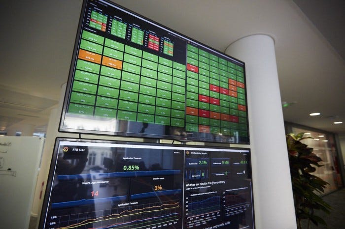
Some years ago, Criteo switched from monolithic applications to microservices. With this new architecture comes challenges like monitoring hundreds of applications, all interacting with each other.
At Criteo, there are several ways to introduce innovation. One of them is the yearly Hackathon! At the 2020 event, the fantastic Firewatch team aimed to improve applications monitoring and ease troubleshooting incidents. Within three days, the team built several visualizations from the application’s data, like HTTP metrics, logs, and traces. Visualizations focused on dataflow between applications and highlight real-time issues, their impact, and their propagation among other applications. After the Hackathon, the team kept working on an essential visualization to complete the proof of concept. Eventually, another team was allowed to own the project to industrialize it as part of their day-to-day work. Thus, this is the origin of “Central Monitoring”.
What is Central Monitoring?

The project’s goal was to create a web application for visualizing the interactions between applications hosted in different data centers, allowing us to get an up-to-date big picture of our services architecture. It displays a graph of services, and for each service, it shows its status and the status of all its endpoints and provides quick access to documentation (links to its repository, logs, dashboards, etc.).
Services could be anything from a .Net or Scala service to a SQL database or a Memcached node.
The graph represents the dependency between the service, pulling data from several different resources (Consul, Prometheus, ElasticSearch) into one view.
In the end, Central Monitoring provides features for different use cases:
- It’s used as the entry point for investigation when alerts fire. An alert indicates a problem with a service. However, this problem is not often the root cause. Usually, the real issue has to be traced back to the original faulty service by checking dependencies one by one. Central Monitoring eases this investigation step by displaying all the dependencies of the faulty service and providing documentation links for deeper investigations.
- When decommissioning a service, we can quickly identify the remaining clients of this service.
- When deploying a service to a new data center, we can identify the dependencies required in the same data center.
- For long-running maintenance operations on a database, we can identify the clients of the database and then estimate the operation’s impact.
- The dependency graph visually identifies which services to start/stop in the correct order.

On tackling graph dependency discovery
In our service Discovery SDK, we added a log in ElasticSearch when an application tries to discover a service for the first time. This log indicates the source service and the destination service. Finally, monitoring those logs helps find the dependency graph. Later, a static file to handle specific situations not covered by the service discovery could be used.

Service status
As our Central Monitoring application shows the status for every service in the graph, which may include a wide variety of services, we were willing to provide a way to define a different kind of status for different types of services. For example, a pass-rate-based metric could be appropriate for web API but not SQL databases. In addition, we were also willing to bring the opportunity for service owners to customize the status definition.
For those reasons, we decided to use a dedicated Prometheus perimeter as a single source of truth for our needs. This method isolates our monitoring application from other Prometheus perimeters in Criteo. Furthermore, it centralizes status calculation in one place, where different people can import metrics and compute new ones using recording rules to define their custom status calculation for the kind of service they own.
Future
The dashboard is now ready-to-use, with all the services, their dependencies, their status, and their documentation. Still, there are several ways to improve the content and the user interface:
- Tracing data: the dashboard relies on discovery data to build the graph of clients/dependencies. Let’s say A depends on B, and B depends on C and D. Requests on A trigger requests on B, which triggers on C but never on D. We could get this information from the tracing data and then remove D from the graph of A. This will ease the readability of the graph for incident troubleshooting.
- Kafka topics: Many services at Criteo produce or consume messages from Kafka topics. Currently, the dashboard shows the dependencies between services and Kafka services but knowing which topic is used is way more interesting. Also, computing a status for a topic, for its latency, for example, could be used to explain other issues. This will display applications impacted by a faulty topic.
- Couchbase buckets: the dashboard can already show dependencies between services and Couchbase services, but not the used bucket. A bucket could be displayed as a service and linked to its clients.
- Live updates: the dashboard is static: it displays the services, their dependencies, and their computed status when the dashboard is loaded. Live updates could be used to update the status of the services and endpoints. This will allow us to raise notifications when services or endpoints switch to failure and improve incident responsiveness.
- Past status: going back in time to browse past status will be helpful to get the timeline or document past incidents.
- UI improvements:
– Filter services by Consul tag: displayed services are selected one by one. We could use Consul tags to show a bunch of services — for example, all the databases, all the services owned by a specific team, etc.
– Nodes position: the position of the nodes is computed automatically from all the nodes in the graph. We could save the node positions to always display the graph with the same nodes at the same position.
– Nodes shape: the shape of the nodes in the graph could depend on the type of service. For example, a database could be a vertical cylinder, a Kafka topic, a horizontal cylinder, etc.
– Search box: there are often many services in the graph, making it challenging to find the one you want quickly. With a search feature, the targeted service could easily be highlighted.
Future developments will continue with cross-team initiatives.
Conclusion
Before this tool, we had to manually analyze error logs, observe metrics of services, check stack traces, and find out which remote service was called, thus causing the issue. Then, if there was an error in this called service, we had to iterate again by checking stack traces, and so on, until we found the root cause of the problem. It was a long and sometimes painful process.
Criteo has a lot of microservices. It makes sense to have a visual tool for developers to browse those applications (microservices) and their dependencies.
In addition, it has been helpful as a form of documentation (think cartography) of our systems, which also centralizes pointers to many service documentations and dashboards.
With that being said, we always look to strengthen our workforce with talented and passionate software engineers. Have a look at our career page to see if there’s a position you seem to fit. If yes, let’s have a chat over coffee!
Product, Research & Development | Criteo Careers
Product, Research & Development at Criteo. At Criteo, come and meet our teams and join our R & D and also enjoy…
careers.criteo.com