















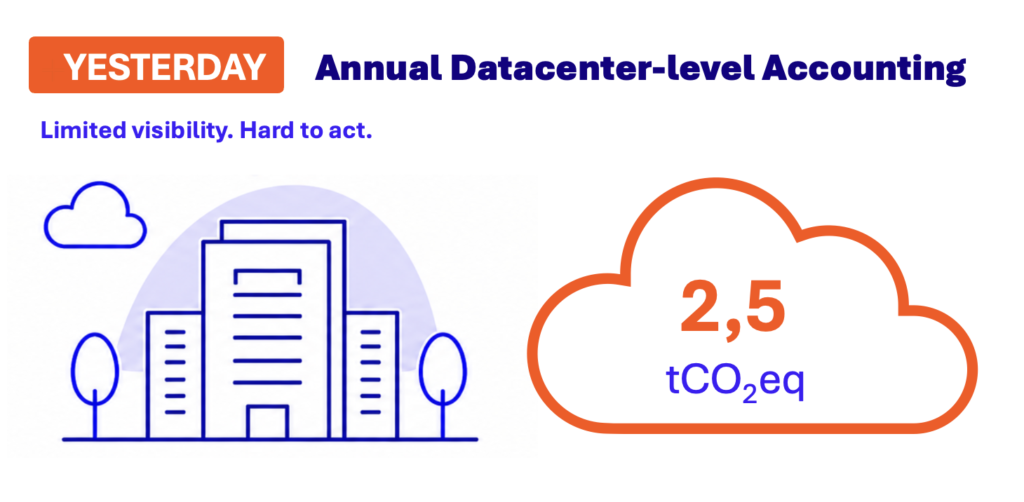
For many years now, we have been computing the global carbon footprint of the Criteo Bare-Metal Infrastructure thanks to the plethora of data we have at the data-center-level — yearly electricity consumption, PUE, the carbon impact of manufacturing the servers, …
This was enough for some time as it allowed us to monitor our impact and work on achieving our SBTi commitments. But as awareness grows, people and teams start asking questions to understand the impact of their applications and their share within the global picture.
Due to the lack of more granular data, questions like “What is the footprint of this specific server in this location?” become harder to answer, and questions like “What is the impact of my application in a specific data center?” even harder.
This is the story of how we reduced that gap at Criteo: from an end user’s genuine question about application emissions to Dashboards and a Web UI where anyone can explore the daily embodied & usage emissions of every physical asset across our fleet.
Since the application impact can be derived as a share of the underlying assets it uses, the first step was to compute the impact of those physical assets and make the result available for exploration.
From data centers to physical assets
Our initial sustainability work focused on facilities: how much electricity each data center uses, how efficient the cooling is, how much carbon is associated with the local grid, and what the manufacturing impact is of all the physical assets. This was good enough for Sustainability reporting and high‑level decisions.
But things are moving forward and we needed to strengthen our approach and methodology:
- New regulations and voluntary frameworks were asking for more granular, auditable data.
- Internally, the infrastructure and product teams wanted to compare hardware options and locations based on carbon impact in addition to price.
- With AI workloads growing, we were about to deploy new, very carbon‑intensive hardware (GPUs) and needed a way to measure their specific impact.
- Reduce the infrastructure impact: to identify the levers and make some carbon savings
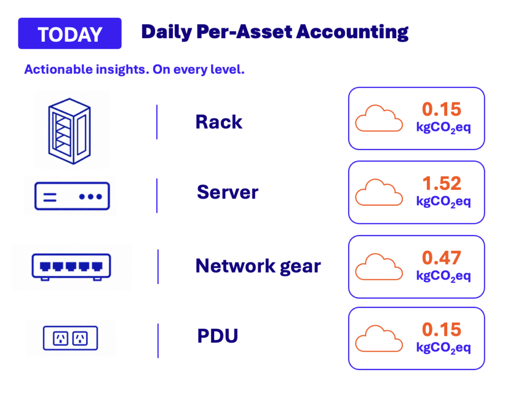
We realized that in order to make meaningful decisions, we had to compute the carbon impact at a more granular level: instead of “X tons of CO₂eq per datacenter per year,” we wanted “Y kgCO₂eq per server per day.”
To do so, we set ourselves a goal:
Compute the daily carbon footprint of every physical asset in our datacenter (server, PDU, rack, network gear), split into embodied and usage emissions, and let our users explore the data in the tools they already use.
Agreeing on what we actually measure
Before we could write a single line of code, we had to answer a deceptively simple question:
“What should be accounted for in the carbon footprint of a server (or any other physical asset)?”
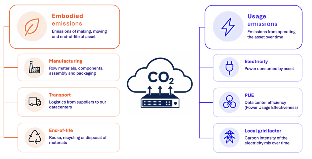
We worked with our partner Hubblo, a consulting firm specializing in the environmental impact of digital technologies, and converged on a model with two complementary parts, mirroring how finance views CAPEX vs OPEX: in our case, embodied and usage impacts.
Embodied impact: before the asset is installed, and once it is decommissioned
The Embodied Impact is the part we often forget; it includes:
- Extracting raw materials and manufacturing boards, chips, and chassis.
- Assembling and shipping the assets.
- Treating the hardware at its end‑of‑life.
We treat embodied emissions like amortized CAPEX in finance: i.e. we amortize the embodied impact over a standard six‑year lifetime to obtain a daily embodied impact of the asset.
There are three components to this:
- Manufacturing
- Vendor ‑ or database‑provided – emission factors for servers, racks, PDUs, and network gear.
- Amortized over a six-year period: Daily manufacturing impact = (hardware manufacturing emission factor) / (365 × 6)
- Hosting & technical environment
- A generic factor from ADEME’s Cloud & Datacenters PCR that represents the impact of the building and its technical environment (beyond electricity).
- Transportation
- Standardized intensities per ton-kilometer for the typical lanes between suppliers, staging locations, and data centers.
- Also amortized over a six-year period.
Once we have all three, we can compute the daily embodied impact of the asset:
Daily embodied emissions
= Daily manufacturing + Daily hosting & technical environment + Daily transportation.
Usage impact: what happens once the asset is powered on
The Usage Impact covers everything that happens during the life of the asset. For this, we take into account:
- Its own electricity consumption.
- The overhead of keeping it alive: cooling, power distribution, UPS, etc., captured via the data center’s PUE.
Conceptually, the formula is pretty simple:
Daily usage emissions
= PUE × Electricity Emission Factor (kgCO₂e/kWh) × Power consumption over the last 24h (kWh).
In other words, consider how much energy the asset uses, adjust for the efficiency of the building, and multiply by how carbon‑intensive the local grid is on that day.
Putting it all together
Once we agreed on this split, two things became clear:
- We couldn’t simply rely on static theoretical power usage values, we needed real measurements from the assets.
- For our engineers and auditors to trust the numbers, our assumptions had to be transparent and auditable.
From whiteboard to pipeline
The first tangible step of the project was not a dashboard; it was a whiteboard covered in arrows between data sources.
We identified five families of inputs:
- Inventory & flavors – what assets do we have, where are they, and which hardware profile (or “flavor”) do they belong to?
- Power metrics – how much power each asset actually consumed over the last 24 hours?
- Data‑center metrics – PUE and location‑specific electricity emission factors.
- Hardware emission factors – manufacturing and end‑of‑life footprint of servers and other assets.
- Transport data – how hardware moves from its manufacturing location to its destination data center, and relocation over its lifetime.
Some of these already existed in our production systems; some lived in Excel sheets or PDF files; others were lost in emails from our vendors; and the rest were missing and had to be requested from our partners.
Normalizing carbon data
We started by building a data service to gather, ingest and normalize all carbon‑related numbers:
- Emission factors
- Transportation footprints
- Real-time power usage of each physical asset
- …
Everything is stored in a database with explicit owners and update processes, so that, for example, the Hardware team can refresh a set of emission factors without touching the rest of the pipeline.
Values change over time, for example, the manufacturing of the same hardware model can evolve and become more efficient; the data service had to handle all of that.
This service became the single source of truth for anything that might appear in a carbon computation.
Daily computation and persistence
With emission factors under control, we can now focus on the daily computation. The shape of the job is deliberately simple:
- For each day and each physical asset:
- Extract the power consumption on that day.
- Retrieve the relevant PUE and electricity emission factor for its data center.
- Fetch its manufacturing and transport emission factors, in addition to the generic hosting factor.
- Compute:
- Daily embodied emissions.
- Daily usage emissions.
- Total daily carbon impact.
- Store results in a database with one row per asset per day.
From there, everything else is “just” data visualization and analysis.
Living with imperfect data
As expected with initial iterations, early runs of the pipeline surfaced all the usual data quality issues:
- Assets with no real-time power consumption metrics.
- Hardware models with unknown manufacturing emissions.
- Assets relocation that were never marked as such.
- …
Instead of waiting for perfect data, which will never happen, we decided to work on a methodology to estimate reasonable replacement values; we would rather have good-enough well-documented numbers than nothing.
Power usage: a ladder of fallbacks
Usually, when real-time power usage metrics are unavailable, they are lost for good for that period of time; for this reason, we use a ladder of fallback heuristics:
- Use real‑time power consumption metrics when available
- Otherwise,
- An asset that is shut down uses no power.
- Estimate the power usage from similar assets doing the same thing, in the same location.
- Fall back on the theoretical power consumption of the hardware model, provided by the manufacturer.
- Estimate the power usage from all assets of the same type (i.e. servers, PDUs…) in the same location.
Each time we move down the ladder, we increase uncertainty — but we are explicit about it and have the metrics to monitor coverage and evolution over time.
Embodied emissions: borrowing from neighbors
The issues are much easier to handle for manufacturing and transportation given that missing past data is not lost forever, although they can change over time,
- Use vendor‑provided values or our partners’ values, when available.
- Otherwise, borrow values from similar assets deployed in the same location to keep transport distances realistic.
- Any remaining gaps are temporarily set to 0, clearly flagged as such — an incentive to liaise with our providers to gather the real data instead of ignoring the problem.
Once the real values are retrieved, we update our metrics database and restart the computation to refine the numbers.
This may sound rough around the edges, but it has the advantage of computing a value for every single physical asset, and making our numbers traceable: when someone challenges a number we publish, we can walk them back through the exact assumptions behind the computation.
Visualization dashboards
Once the database started filling up with results, we moved on to the fun part: exploring them.
With different users and different needs, some interested in digging into the details while others focused on more global views, we built different visualizations that let us answer questions we could not answer before this initiative:
- What is the carbon impact of this specific server in this location on a given date?
- What is the average daily usage impact of this type of server models in a specific year?
- What is the yearly carbon impact in this location (i.e. the sum of all assets in that location)?
- What is the total monthly embodied impact of all network gear on a given month?
- How does the carbon impact of this database evolve over time?
- How much carbon impact did we save by migrating to the newer generation of server models?
- How is the carbon impact distributed across the different types of assets (servers, network gear, etc.)?
- …
All these questions, and many more, become easy to answer and let internal users of Criteo’s infrastructure explore data independently and incorporate the results into workload-sizing and deployment decisions.
What the numbers changed for us
First of all, when we sum everything, we get back to the global carbon footprint of the Criteo Bare-Metal Infrastructure we were previously manually computing, but we now have much more detail, and the conversations shifted from theory to very concrete trade‑offs when we started exploring the results.
Usage dominates, but embodied emissions are important
It comes as no surprise that usage emissions are the largest slice of our footprint: Electricity and PUE still matter a lot.
However, the dashboards make something else visible: for certain fleets — especially those using recent hardware models and high‑end GPU servers — embodied emissions are significant.
This has practical consequences:
- We pay very close attention to how well these GPU servers are actually used, not just how many we have.
- We ensure we continue using server models that can safely run for another year or two before replacing them with newer generations.
Geographic location matters
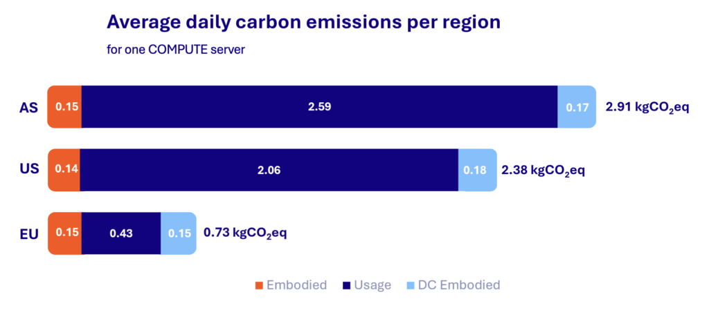
Comparing the same hardware model across different locations highlights how grid mix and facility design interact:
- The same hardware in two regions can have very different usage emissions, purely due to electricity mix.
- High‑density sites with better PUE can offset a part of that, but not all.
This feeds directly into capacity planning and site‑selection discussions: we can now consider both the carbon impact and the financial cost when considering moving workloads from one location to another.
Server models are not made equal
Analysis of the carbon impact of different hardware models shows:
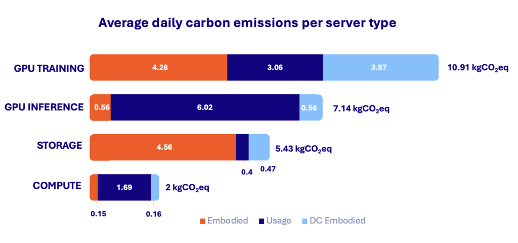
- A couple of large, general‑purpose CPU fleets dominate total emissions because there are a lot of them, and they run all the time.
- Some GPU and storage models have the highest per‑server daily impact.
This leads to more nuanced conversations:
- if you optimize and reduce this particular fleet, here’s how much carbon you can realistically save
- if you migrate to a different hardware model, here’s how the carbon impact will change
- if you pick this specific server model for your fleet, here’s how much carbon impact to expect
The wider picture
We are taking a complementary angle on the infrastructure side:
- Grounding our calculations in recognized methodologies (GHG Protocol, ADEME’s Cloud & Datacenters PCR).
- Treating upstream emissions (manufacturing, buildings, transport) as first‑class citizens, not a footnote to electricity.
- Making the results available and usable by our engineers, not just sustainability specialists.
Our hope is that, as more actors share their methods and data, we can converge on standards that make hardware and site choices comparable across the industry.
What next?
We are quite happy with this first iteration, yet we already know how to improve on this:
- Refine data
- Use daily electricity emission factors instead of annual averages.
- Integrate relocation emissions directly into the embodied impact of assets.
- Broaden the scope
- As stated above, we can now compute the carbon impact of each individual asset we have in our infrastructure
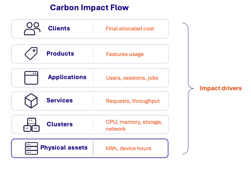
- The next step would be to compute the impact of each application, each product, each user…
- To do so, we will rely on the redistribution framework we already have in place to propagate the monetary cost of these physical assets to their users, and their users’ users…
- The idea is that the cost is first allocated to its direct clients, such as technology clusters, whose cost is then redistributed to the services and applications running on those clusters according to their resource consumption, and this logic continues up the stack until we reach the production and clients.
- Our goal for carbon is to reuse the same framework so that carbon emissions follow the same allocation paths.
- This will let us compute the carbon cost of each layer, each service, each application, each product, each user.
Closing the loop
Remember that original question — “What is the footprint of this specific server in this location?”
It now has a concrete answer.
More importantly, it unlocks new kinds of discussions inside Criteo:
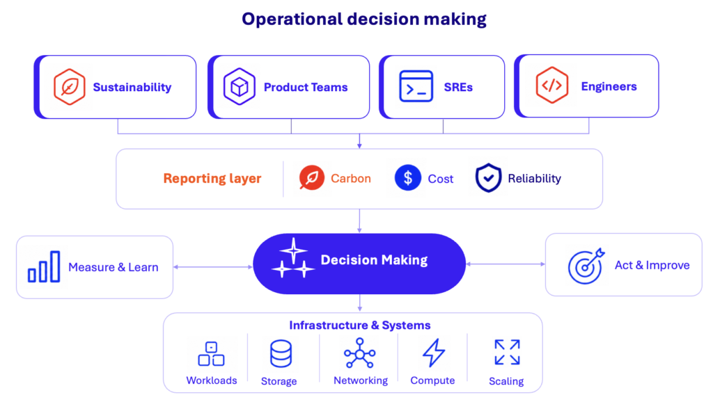
- SREs and hardware engineers discussing the carbon impact of hardware models in the same breath as reliability and cost.
- Product teams asking for carbon estimations (in addition to cost estimations) to feed into their own roadmaps.
- Sustainability work that is embedded in everyday infrastructure decisions based on realtime carbon impact, not just in yearly reports.
There is a lot still to improve in our data and our methodology, but one thing is clear: once you can see the carbon footprint day by day, site by site, it becomes much harder to ignore — and much easier to act on.